A Little Sneak Peek of our New Interface
11 Sep 2018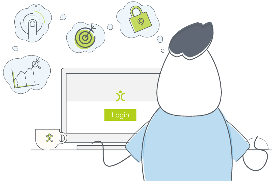
A little over a year ago, we made a decision to give our system a little refresh. It was important to us that this new interface still FELT like OpenCRM, but gave it a much needed upgrade.
So we started looking through some old designs, checking out the competition, and gathering customer feedback to see what were the top priority items.
Basically, we were asking:
What should a CRM system be?
The answer we got took us to the idea that we needed to brighten some of the colours, make the text easier to read, and add a few new features to modernise the navigation.
We’ll be releasing this new version next week, so keep your eyes peeled for more information.
Colours: It’s not that easy being green
One of the first things people say when they look at this new interface is how much brighter it looks than the previous one. We got rid of the heavier grey, brightened up the green (just in case you didn’t notice it), and generally standardised the whole scheme.
One of the things we heard from customers over the years was that the white text on green buttons, while visually striking, wasn’t always easy to read. We listened and did some tests internally to find the right colour combination that was easy to read and still let OpenCRM keep a touch of our old green buttons.
Text: Bigger sometimes is better
In addition to recognising that some of our colour combinations made screen reading difficult, we knew that this new interface needed bigger text while still making sure enough information was kept on the page to be useful to our customers.
To help with this, we increased the font size, cleaned up the background, and selected a new font that would be that bit easier to read.
New Features: Our top three
This new interface includes many great new features, but there are three that are really at the core of where we see OpenCRM going in the future.
The Sidebar
We decided to collapse the top bar navigation and moved these elements into a list that could be combined with our key sidebar widgets.
This wasn’t an easy decision as that top navigation has been central to OpenCRM since the very beginning (back in 2005). But we think this change gives the system a cleaner look, while still keeping all the functionality we had before.
A New Calendar
Another big part of this new interface was the recognition that our Calendar, while having some great functionality, was looking a little out of date. So we gave it a facelift, adding drag-and-drop functionality, improving the way the mini-calendar loaded, and generally tidying the whole page.
All of the mini-module lists are still there, so you will still be able to use your Calendar page as your OpenCRM hub.
Keyboard Shortcuts
And finally, we have added a couple simple keyboard shortcuts that allow you to navigate to a module home screen, create a new record, and search the system. All this without ever having to reach for your mouse!
Although I originally hail from northern California, as soon as I arrived in Yorkshire I knew it was the place for me! At OpenCRM, I started out in the Business Development team, and then moved into compliance and Q&A because I love telling people what to do…ok, that’s not the real reason, but it makes for a good bio one-liner. When I’m not in the office, you can usually find me tramping through the dales, crafting, gardening, or with my nose in a book.